Bar Graphs
A Bar Graph (also called Bar Chart) is a graphical display of data using bars of different heights.
Imagine you just did a survey of your friends to find which kind of movie they liked best:
| Table: Favourite Type of Movie |
| Comedy | Action | Romance | Drama | SciFi |
|---|
| 4 | 5 | 6 | 1 | 4 |
We can show that on a bar graph like this:
It is a really good way to show relative sizes: we can see which types of movie are most liked, and which are least liked, at a glance.
We can use bar graphs to show the relative sizes of many things, such as what type of car people have, how many customers a shop has on different days and so on.
Example: Nicest Fruit
A survey of 145 people asked them “Which is the nicest fruit?”:
| Fruit: | Apple | Orange | Banana | Kiwifruit | Blueberry | Grapes |
| People: | 35 | 30 | 10 | 25 | 40 | 5 |
And here is the bar graph:
That group of people think Blueberries are the nicest.
Bar Graphs can also be Horizontal, like this:
Example: Student Grades
In a recent test, this many students got these grades:
| Grade: | A | B | C | D |
| Students: | 4 | 12 | 10 | 2 |
And here is the bar graph:
You can create graphs like that using our Data Graphs (Bar, Line, Dot, Pie, Histogram) page.
Histograms vs Bar Graphs
Histograms
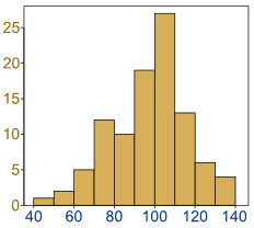
Histogram: a graphical display of data using bars of different heights.
It is similar to a Bar Chart, but a histogram groups numbers into ranges .
The height of each bar shows how many fall into each range.
And you decide what ranges to use!
Example: Height of Orange Trees
You measure the height of every tree in the orchard in centimetres (cm)
The heights vary from 100 cm to 340 cm
You decide to put the results into groups of 50 cm:
- The 100 to just below 150 cm range,
- The 150 to just below 200 cm range,
- etc…
So a tree that is 260 cm tall is added to the “250-300” range.
And here is the result:
You can see (for example) that there are 30 trees from 150 cm to just below 200 cm tall
(PS: you can create graphs like that using Make your own Histogram)
Notice that the horizontal axis is continuous like a number line:

Example: How much is that puppy growing?
Each month you measure how much weight your pup has gained and get these results:
0.5, 0.5, 0.3, −0.2, 1.6, 0, 0.1, 0.1, 0.6, 0.4
They vary from −0.2 (the pup lost weight that month) to 1.6
Put in order from lowest to highest weight gain:
−0.2, 0, 0.1, 0.1, 0.3, 0.4, 0.5, 0.5, 0.6, 1.6
You decide to put the results into groups of 0.5:
- The −0.5 to just below 0 range,
- The 0 to just below 0.5 range,
- etc…
And here is the result:
(There are no values from 1 to just below 1.5, but we still show the space.)
The range of each bar is also called the Class Interval
In the example above each class interval is 0.5
Histograms are a great way to show results of continuous data, such as:
- weight
- height
- how much time
- etc.
But when the data is in categories (such as Country or Favourite Movie), we should use a Bar Chart.
Frequency Histogram
A Frequency Histogram is a special graph that uses vertical columns to show frequencies (how many times each score occurs):
 |
Here I have added up how often 1 occurs (2 times),
how often 2 occurs (5 times), etc,
and shown them as a histogram. |
Bar Graphs are good when your data is in categories (such as “Comedy”, “Drama”, etc).
But when you have continuous data (such as a person’s height) then use a Histogram.
It is best to leave gaps between the bars of a Bar Graph, so it doesn’t look like a Histogram.
Pie Chart
Pie Chart: a special chart that uses “pie slices” to show relative sizes of data.
Imagine you survey your friends to find the kind of movie they like best:
| Table: Favourite Type of Movie |
| Comedy | Action | Romance | Drama | SciFi |
|---|
| 4 | 5 | 6 | 1 | 4 |
You can show the data by this Pie Chart:
It is a really good way to show relative sizes: it is easy to see which movie types are most liked, and which are least liked, at a glance.
You can create graphs like that using our Data Graphs (Bar, Line and Pie) page.
Or you can make them yourself …
How to Make Them Yourself
First, put your data into a table (like above), then add up all the values to get a total:
| Table: Favourite Type of Movie |
| Comedy | Action | Romance | Drama | SciFi | TOTAL |
|---|
| 4 | 5 | 6 | 1 | 4 | 20 |
|---|
Next, divide each value by the total and multiply by 100 to get a percent:
| Comedy | Action | Romance | Drama | SciFi | TOTAL |
|---|
| 4 | 5 | 6 | 1 | 4 | 20 |
|---|
4/20
= 20% | 5/20
= 25% | 6/20
= 30% | 1/20
= 5% | 4/20
= 20% | 100% |
|---|
Now to figure out how many degrees for each “pie slice” (correctly called a sector).
A Full Circle has 360 degrees, so we do this calculation:
| Comedy | Action | Romance | Drama | SciFi | TOTAL |
|---|
| 4 | 5 | 6 | 1 | 4 | 20 |
|---|
| 20% | 25% | 30% | 5% | 20% | 100% |
|---|
4/20 × 360°
= 72° | 5/20 × 360°
= 90° | 6/20 × 360°
= 108° | 1/20 × 360°
= 18° | 4/20 × 360°
= 72° | 360° |
|---|
Now you are ready to start drawing!
Draw a circle.
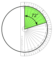
Then use your protractor to measure the degrees of each sector.
Here I show the first sector …
Finish up by colouring each sector and giving it a label like “Comedy: 4 (20%)“, etc.
(And don’t forget a title!)
Another Example
You can use pie charts to show the relative sizes of many things, such as:
- what type of car people have,
- how many customers a shop has on different days and so on.
- how popular are different breeds of dogs
Example: Student Grades
Here is how many students got each grade in the recent test:
And here is the pie chart:
Example: 1) 40 children of a class were asked to vote for their preference | | | | | |
for one of the five core subjects taught in their school, the result were as follows | | | | | |
| | | | | |
| Subjects | English | Mathematics | Science | Sanskrit | Social Science |
| No.of students | 6 | 10 | 9 | 7 | 8 |
| | | | | |
| Solution:- | | | | | |
| | | | | |
| Subjects | No. of students | Central angle= Value of the component / Total value X 360 degree | | | |
| English | 6 | Central angle=6/40 X 360 = 54 degree | | |
|
| Mathematics | 10 | Central angle=10/40 X 360 = 90 degree | | |
|
| Science | 9 | Central angle=9/40 X 360 = 81 degree | | |
|
| Sanskrit | 7 | Central angle=7/40 X 360 = 63 degree | | |
|
| Social Science | 8 | Central angle=8/40 X 360 = 72 degree | | |
|

Exercise 5.4: 1) Favourite outdoor of students are listed below. | | | | | |
Draw a pie chart for the same . | | | | | |
| | | | | |
| Outdoor Games | Basketball | Cricket | Hockey | Football | Volleyball |
| No.of students | 120 | 180 | 60 | 150 | 90 |
| | | | | |
| Solution:- | Total Number of students = 600 | | | | |
| | | | | |
| Subjects | No. of students | Central angle= Value of the component / Total value X 360 degree | | | |
| Basketball | 120 | Central angle=120/600 X 360 = 72 degree | | | |
| Cricket | 180 | Central angle=180/600 X 360 = 108 degree | | | |
| Hockey | 60 | Central angle=60/600 X 360 = 36 degree | | | |
| Football | 150 | Central angle=150/600 X 360 = 90 degree | | | |
| Volleyball | 90 | Central angle=90/600 X 360 = 54 degree | | | |


